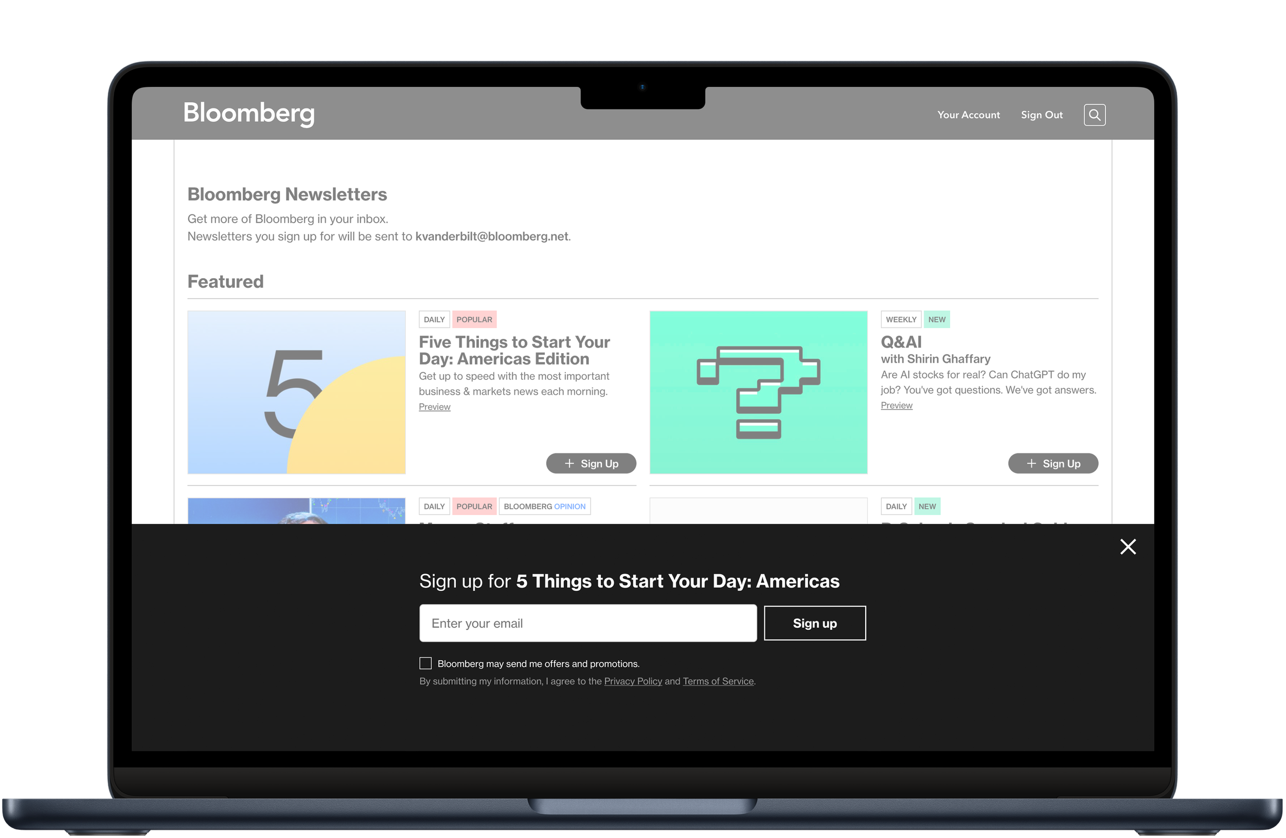
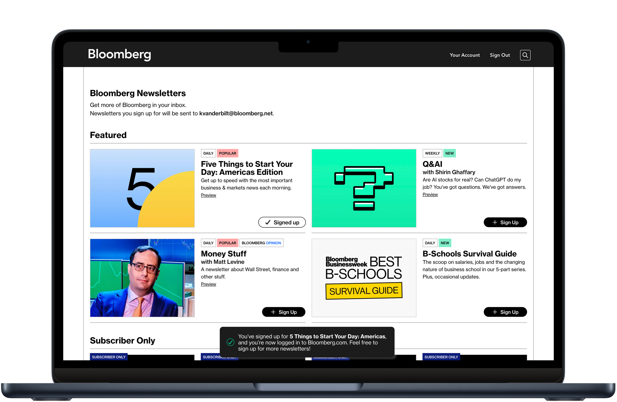
The newsletter signup process on Bloomberg.com has been re-thought with a new experience across the management page, individual newsletter pages and in-article promotions.
The new newsletter management page features branded artwork for each newsletter and a revamped signup process. The page’s visual system extends everywhere newsletters show up, including individual pages for each newsletter and promotions on article pages.
My role: Lead product designer responsible for UX and UI design across desktop and mobile web products. Created at Bloomberg.
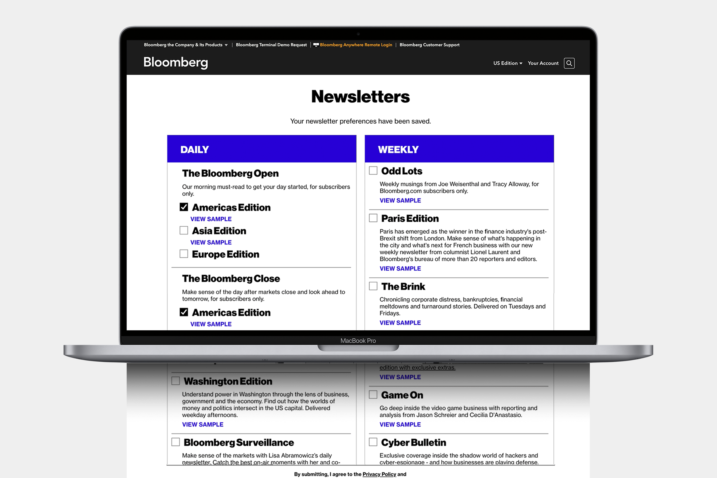
Before...
...and after
Project Goals
Update the design and codebase of the newsletter management page, bringing it more in line with the rest of Bloomberg.com, and enabling page editing using the internal CMS
Highlight the branded imager for each newsletter, and add artwork for newsletters that don’t yet have any
Extend the system onto individual newsletter pages, in-article touts, and on the homepage
Process Highlights
Wireframes roughly blocked out the size and location of page content
Design and Iteration defined and refined the look and feel of each element
User Research and Stakeholder Workshops helped answer the question: How should we organize the content?
Final Design & Handover provided developers with everything needed to build across break points, and to pull from and add to the design system
Design QA throughout the Production phase ensures that all page elements function as intended and are built to spec
In-article touts
Individual newsletter pages


